
Surprise, surprise!
Though I have written some ‘guest editorials’ in the past (look here!) this will be my first piece in English on my bookish blog Perkamentus. Let me first I apologise to my (few) Dutch readers who can’t read English! I promise to keep it short with almost no text and lots of illustrations.
As some of you have probably noticed I started sometime ago with English tweets. Soon I gained some foreign followers who, I’ am afraid, don’t read or speak Dutch. One of them is Lynn Roberts from the ‘The Frame Blog’ who was kind enough to pre-read my piece (thanks again Lynn!).
Now most of them are interested in art and history (but not necessarily in old books).
I‘m an art lover too but first and foremost a bibliophile so the idea of writing a piece that combines ‘the best of both worlds’ was soon born.
This blog post is illustrated with some examples of engraved head- and tail-pieces I have encountered in my old books (all titles present in the Short-Title Catalogue, Netherlands). Although they have never been a special subject on my blog yet I will refer to two previous illustrated posts to make as much room as possible for new illustrations here. By the way, about my photo fingers, they are just there to give you an impression of their size (I mean the head- and tail-pieces, not my fingers!).

Head- and tail-pieces are book decorations and most of them not bigger than a square inch. In most modern books they have been dispensed with, or sometimes reduced to a simple line, dot or star but in handmade private press books you can still find them.
In the 17th and 18th centuries they were quite common and my impression is that you will find them more often in books about art or poetry than in pure science books.
Many of the original tools used for book printing and book illustrating from those centuries have not survived. Probably one of the world’s most interesting and biggest collections of old type-ornaments like head- and tail-pieces (almost 9,000 items) can be found in the Museum Enschedé in Haarlem. A few examples from this collection are reproduced in: “Type foundries in the Netherlands from the fifteenth to the nineteenth century” (Haarlem, reprint 1978, page 357-362) by Charles Enschedé (1855-1919).

What exactly are head- and tail-pieces? Well, headpieces in books are type-ornaments at the head of a chapter or division and tailpieces are - guess what? - type ornaments at the end of a chapter or division (note: exactly the same sort of motif is often used as so-called ‘vignette’ on typographical title pages).
Originally these kinds of illustrations were woodcuts but by the end of the 17th century most of them are engravings on copper. Is there some way of classifying them? Yes! “Head-pieces (like tail-pieces and initials), may be divided into two classes—first, those enclosed within a parallelogram or other regular figure; and secondly, those which are free or irregular in outline. The first class is again subdivided into those with solid or stippled background, and those in which the background is white. In some specimen-books the same device may be found in three forms—enclosed in a boundary-line with solid background; in boundary line without ground; and free—the boundary line removed” (in “Typo: A Monthly Newspaper and Literary Review“ (Volume 2, Issue 20, 25 August 1888).
They come in all kind of different forms and variations. Some have reference to the text, but most are entirely fanciful. Some simple tailpiece examples are shown below (click on the images to enlarge!):

Others are tiny framed scenes, like these seven from a book (a laudatory poem on the river Amstel) by Nicolaas Simon van Winter (1718-1795); “De Amstelstroom, in zes zangen” (Amsterdam, 1755).

If the headpiece is as wide as the text block below we speak of a ‘headband’, rather than a headpiece, like the one on top of this blog post! A good example of a beautiful headband is the one I found (look here!) in: “Noodsakelyck wereld-haten op de woorden Christi.” (Amsterdam, 1634), by the Dutch Catholic playwright Jan Hermansz. Krul (1602-1646). This one together with the tailpiece used in the same book is especially interesting because we find both pieces together eight years later as a single tailpiece in Pieter Corneliszoon Hooft’s (1581-1647) famous history book: “Neederlandse Histoorien“ (Amsterdam, 1642). Since they are printed by two different presses it shows us that printingtools, borrowed, purchased, inherited or otherwise acquired often wandered around.

Most head- and tail-pieces are elaborately braided ornamental forms, others are more or less pastoral scenes, flower arrangements or portraits. For some very delicate examples, take a look at the illustrations (here!) in a previous blog post I wrote on the rare erotic poetry debut of Willem Bilderdijk (1756-1831). This first edition is normally illustrated with 28 little head- and tail-pieces all engraved by the author himself (which is quite extraordinary). Only three copies I know of have an extra 29th tailpiece with his motto “Semper Idem”, two of them in a public library, one in my collection.
The biggest and most sumptuous head- and tail-pieces in my library are found in two books. The first is by Jan Baptista Wellekens (1658-1726) and Pieter Vlaming (1686-1733): “Dichtlievende Uitspanningen” (Amsterdam, 1735). In this octavo edition the pieces are proportionally very big (sometimes 3.5 x 4.5 inches). Many head- and tail-pieces for these laudatory poems of some long-gone estates near Amsterdam show us monumental garden pieces and thus have a direct relation with their subject. In this case several pieces are not only signed by the engraver (and poet) Jan Goeree (1670-1731), but also dated!
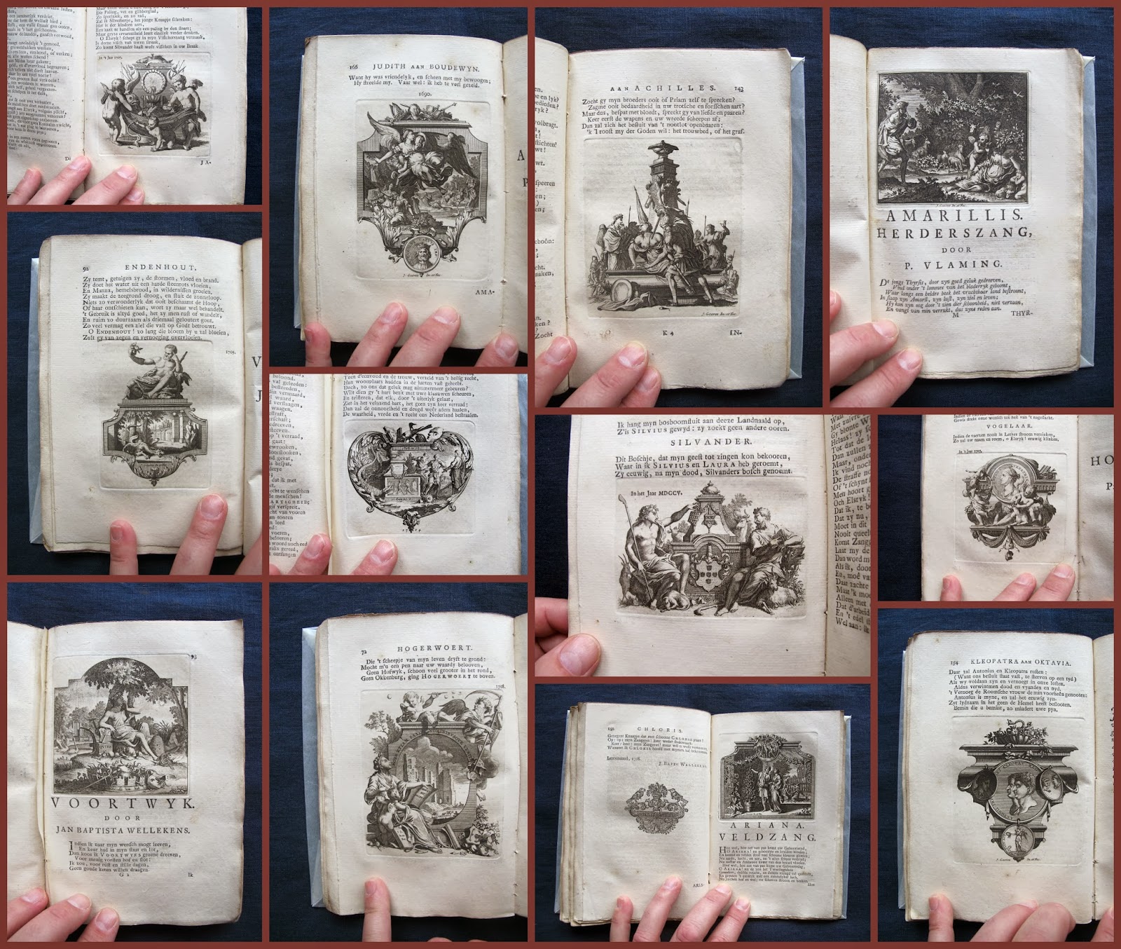
The second book is a folio edition of an art historical work (about antique tokens) by the painter and historian Frans van Mieris II (1689-1763): “Historie der Nederlandsche Vorsten” (‘s-Gravenhage, 1732-1735). His headpieces are everything but small (7.06 x 5.15 inch) and there is one in every volume for every first chapter. All three show us scenes packed with symbolic figures and attributes and are very beautifully framed.

Like the headpieces the tail-pieces (below) in these volumes are signed too, by Jan Wandelaar (1690-1759) or Bernard Picart (1673-1733) both famous engravers in their time.

What’s very interesting in these books is the endnotes in volume two and three with a calculation (“Uitreekening”) of the different costs made for paper and illustrations.
The big headpieces (“Het Vignet aan het hoofd…”) cost ten cents and the tailpieces (“Vijf Vignetten…”) two cents each and were probably specially made for this work.This reminds us that books in those days were something different than the ready-made stuff you find in your local bookstore nowadays! Text and illustrations were separately printed (and paid for) and then there remained the question of an (often expensive) bookbinding!


Nogmaals gefeliciteerd Piet! Interessant stuk! Met lekker veel plaatjes!
BeantwoordenVerwijderenRob @Dezilvereneeuw
Deze reactie is verwijderd door de auteur.
Verwijderen